How can you present survey data in a way that won’t bore your audience to tears?
Well, we all know that unique visuals like infographics can make charts and graphs more engaging. Survey data is easily translated into graphs and charts, making survey results and infographics the perfect marriage!
Survey results infographics combine text, charts, and graphics to add a little pizzazz to your data. They’re much more interesting than numbers plopped in a table, and they can help viewers latch on to key survey insights.
So without further ado, let’s get into everything you need to know to make a survey results infographic.
First, I’ll review some different types of survey charts that work for different types of survey data. Then, I’ll take you through some of the most popular types of survey results infographics, with some tips for how to make your results pop.
How to display survey results
Let’s talk chart types.
Visualizing survey data effectively means using different types of charts for different types of survey results (i.e. binary, rating scale, multiple choice, single choice, or demographic results).
Binary results
If your survey questions offer two binary options (for example, “yes” and “no”), a pie chart is the simplest go-to option.
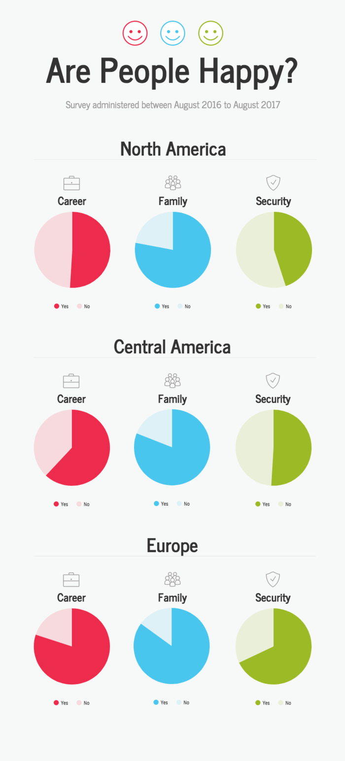
Using pies for binary results is pretty self-explanatory. Basically, just use a single pie slice to highlight the proportion of “Yes” responses compared to “No” responses. For the “Yes” responses, use a brighter, more saturated color and start the segment at 12 o’clock on the pie chart:
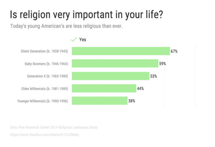
If you want to compare the response rates of multiple groups, skip the pies and go for a single bar chart. A bunch of aligned bars are much easier to compare than multiple pie charts. Don’t forget to label each bar with its percentage for clarity:
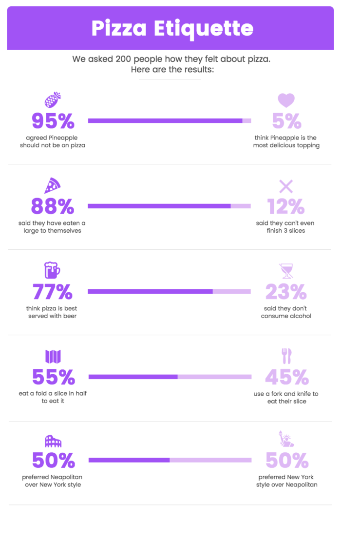
For a fun alternative that’s less information-dense, you can split up the bars to make a sort of modified 100% stacked bar chart. This frees up some space to add better labels for both the “Yes” responses and the “No” responses.
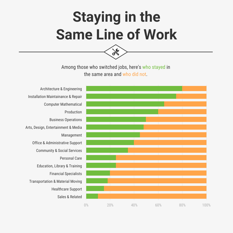
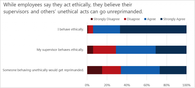
Or, forget about the extra notes and let the data speak for itself. Use a standard 100% stacked bar chart, color-coded to contrast the different responses, and sorted for readability.
Rating scale results
In a rating scale question, survey takers are offered a spectrum of possible answers and are asked to select an answer along that spectrum.
This type of question is often found on customer satisfaction surveys, used to gain an understanding of customer sentiment about a product or service. It's also popular for post event surveys, to gage how much people enjoyed the event.
Most commonly it comes in one of two forms: the Likert scale (“Strongly Disagree,” “Disagree,” Neutral, “Agree” and “Strongly Agree”) or the Net Promoter Score (NPS, ranging from 0 to 10). The NPS is used to judge the willingness of a customer to recommend a product or service to others.
The 100% stacked bar chart is the simplest option for visualizing survey data from rating scale questions. It’s quick to make, and presents the proportion of responses in each category quite clearly.
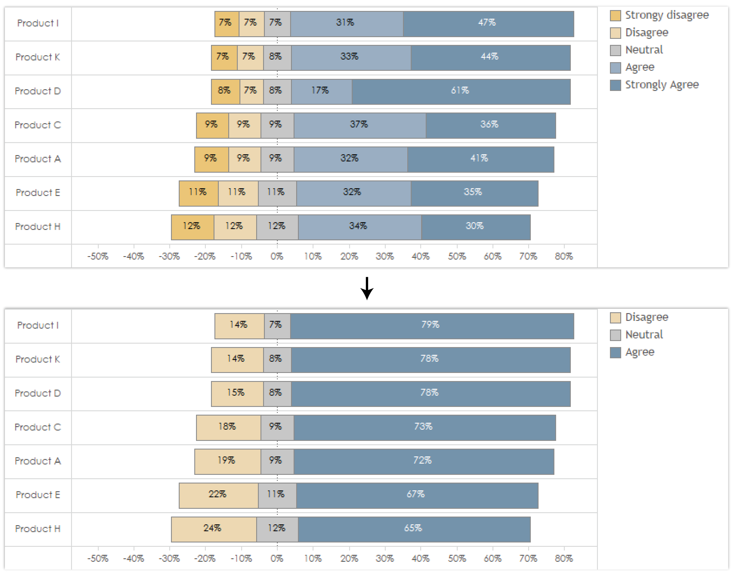
With either of these scales, it’s helpful to summarize the results into coarser categories. Take the five- and ten-point Likert and NPS scales and summarize them into simpler three-point scales (“disagree”, “neutral”, and “agree” or “positive”, “neutral”, and “negative”).
Presenting survey results in a simplified categories goes a long way in making the chart easier to read.
Demographic results
If your survey gathers information about the respondents’ demographics in addition to other survey results, you may want to use that data as part of your analysis. Including factors like age, gender, income level, and even geographic location can make for an interesting infographic.
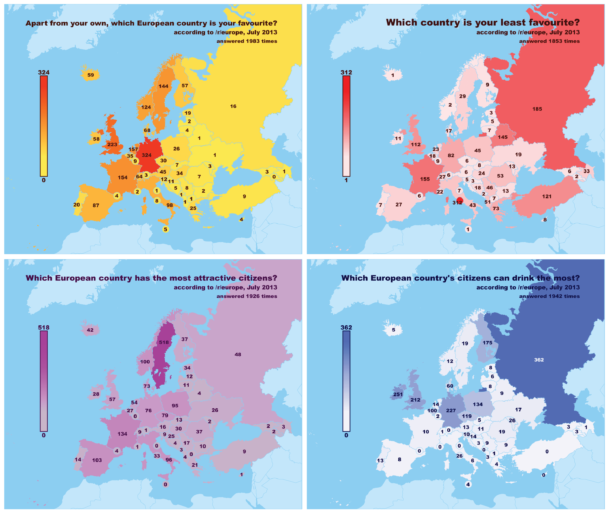
Visualizing survey data on a map is a fun way to include a demographic component in your infographic. A chloropleth map, like you see below, can be used to show the distribution of some data by geographic location. Different values are represented by different shades of a given color, so no reading is required:
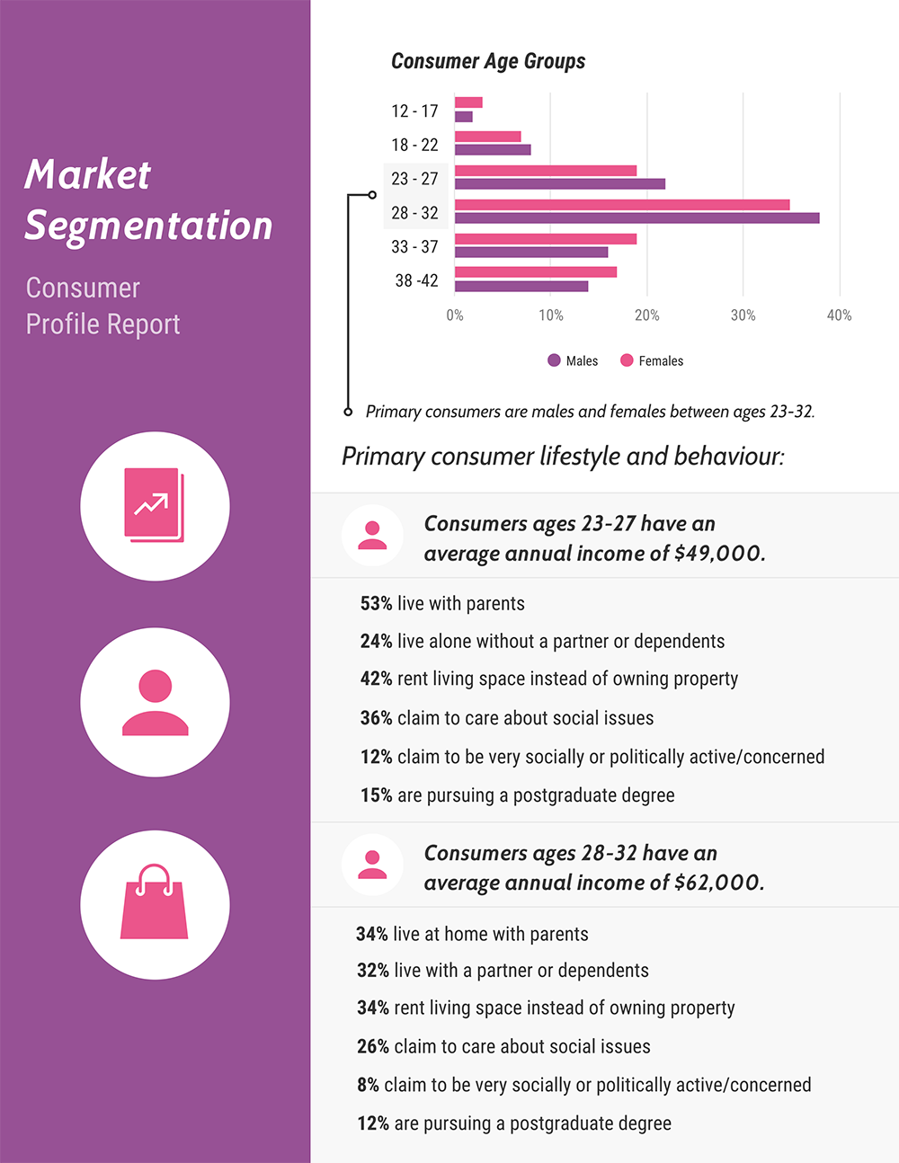
Histograms, on the the other hand, can be used to show the age distribution of a particular population. They can easily incorporate data on gender, too:
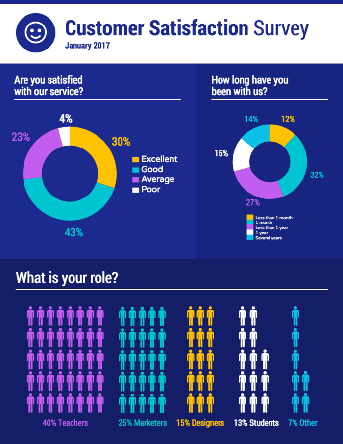
While these specialized survey charts are great for more complex data, they won’t always be necessary. Consider using an icon chart when you want to make a simpler type of demographic data, like job or role, a feature of your design. They’re a fun way to add more impact to simple results.
Open-ended comments
Open-ended questions (questions that require respondents to write out their own answer, rather than selecting a preset answer) present a bit of a challenge. In order to visualize them, the answers need to be grouped in some way, either through common keywords, sentiments or some other factor.
Word clouds, though frowned upon by some data visualization experts, can be a quick way to get summary of this type of qualitative data.
They’re great for audiences who don’t have experience with data-heavy tables or statistical analysis, and they’re easy to make. Just pick out the most frequently-used keywords from the comments and plug them into our word cloud generator.
Otherwise you’ll have to do a more intensive manual qualitative analysis. Go through the open-ended responses and create categories.
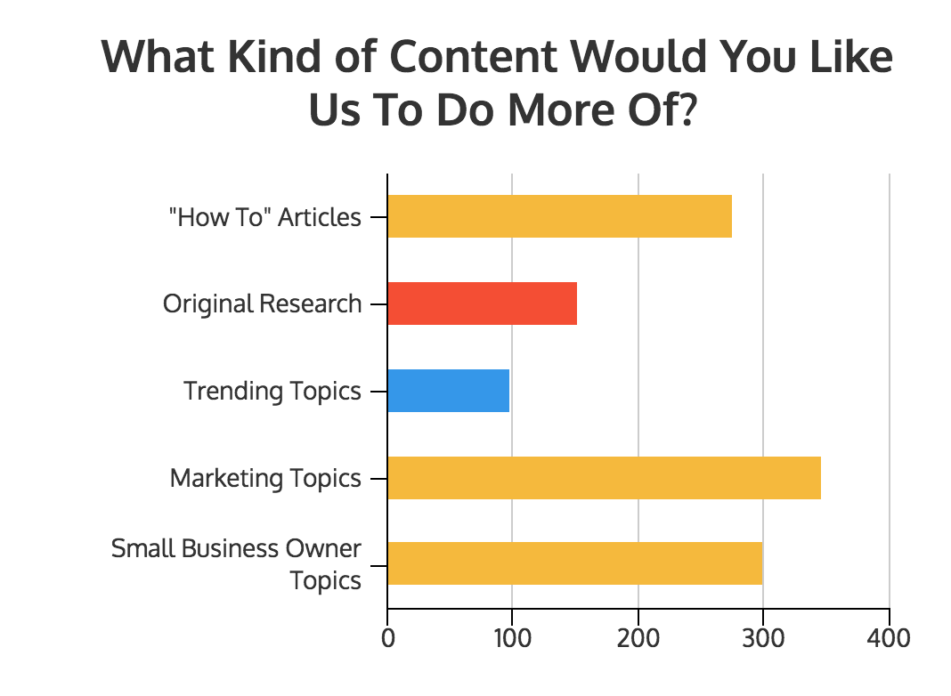
Once you’ve quantified your answers, you’ll be able to present the results in a bar chart like this one, which shows the percent of comments that fall into each category.
Multiple choice results
Multiple choice questions allow respondents to select one or more answers from a list of possible answers.
The best visual for this kind of survey is a simple bar chart.
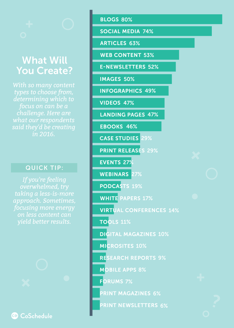
For the questions that allow respondents to make more than one selection, you’ll need to calculate the percentage of people who chose each answer, like you see in this chart from CoSchedule:
As always, bars should be sorted from greatest to least.
Pie charts are a decent option for times when respondents can only select a single answer. Keep in mind, though, that they’re not ideal if you’ve got a lot of data. If you have more than a few different responses to show, try giving each one its own chart:
Types of survey results infographics
Now that we’ve covered the best chart types for each type of survey result, let’s get into how we might combine survey charts to make a complete infographic.
A survey results infographic should use a combination of charts, graphic elements, and annotations tell a story.
Single-column summary infographics
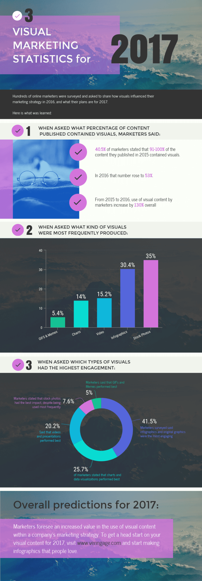
The most popular type of survey results infographic is the single-column summary infographic. It sums up all of the major takeaways of a survey, explicitly stating the most important insights.
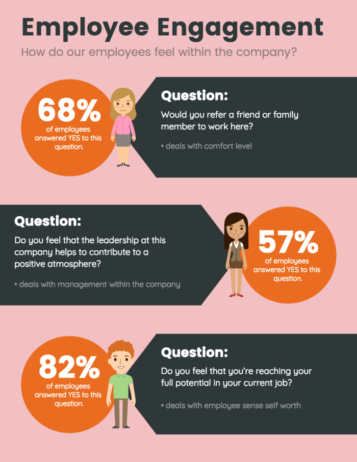
It might show the results of every survey question simply, using a large, bold number or basic chart for each question:
Or it might present a comprehensive overview of the data, with a more detailed, annotated chart for each survey question:
It might add some extra commentary after each question, too.
Either way, it presents the questions sequentially, in a single column, so that viewers can scroll through to read the results like a story.
To make your own single-column summary infographic, simply start at the top with the first question, and work your way down until you’ve covered each of the major survey insights. State each question, add the results in the form of a chart, and add notes about any interesting learnings.
To add some visual organization to a single-column infographic, use different background colors to create distinctions between sections. Add colored blocks behind each question to divide up the content.
Like you can see in the Netflix survey above, alternating red and black background colors adds a pleasing sense of rhythm and makes the infographic easier to scan.
Letter-sized summary infographics
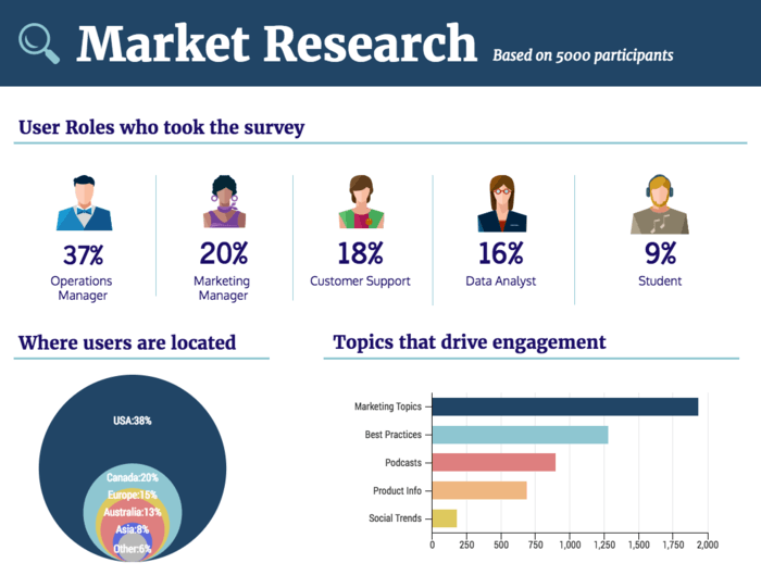
If your survey is only a few questions long, a big single-column infographic is probably overkill. It might be better to stick with a basic 8.5”x11” page, and make it all about the numbers.
Forget about adding lots of notes, comments, and annotations. Just state each question in the simplest possible terms (i.e., “Where users are located”), and use simple survey charts to sum up the results.
Make sure you organize the charts based on an underlying grid, or you might end up with a jumbled mess.
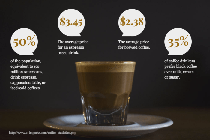
Or you can even forget about charts altogether, and present the key takeaways as simply as possible. Use big, bold numbers to make a statement:
Letter-sized feature infographics
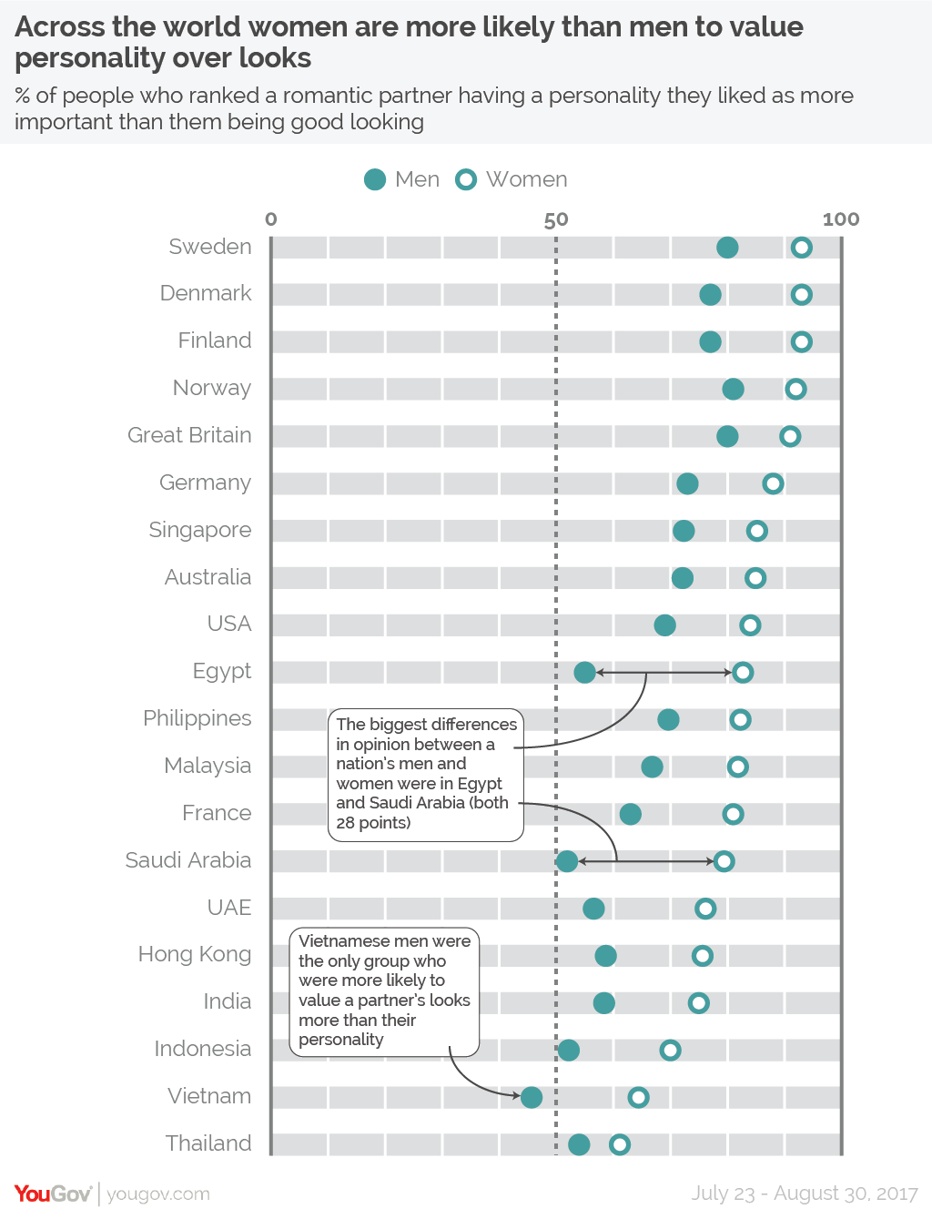
The last go-to option for presenting survey results is the one-page feature infographic. It couldn’t be more simple. It breaks down the results of a single survey question, in a single chart, on a single page.
We like to call this the “power stat” infographic. It combines a very simple chart with some big, bold text for a high-impact result:
Design best practices for presenting survey results in infographics
Even if you have the most interesting survey data ever, no one will give it a second look if your infographic is poorly designed. Keep these best practices in mind when you make your next survey results infographic.
Clearly label charts to provide context and prevent misinterpretation
Your readers should be able to understand your survey charts in only a few seconds’ glance. And if you ask me, that makes chart labels the most important chart elements (after the data itself, of course).
Descriptive labels can be used to add context to the data--to spell out the conclusions and implications of the data in the chart. This extra text will help to ensure that nothing is misinterpreted or lost in translation between you and your audience.
A well-labelled chart looks something like this:
The labels stand out against the background of the chart, with arrows clearly tying them to their respective data points.
Simplify the data to create clarity
It can be tempting to include every single data point in a visualization, but that won’t do you any good!
Be selective with your data. Just because you have a lot of data doesn’t mean your audience will want to spend hours scrolling through a mile-long infographic.
Select the most important results, and leave the rest for more in-depth summaries like white papers or reports. Include some supporting data if you need to, but remember--data visualization is all about cutting through the clutter.
Don’t embellish your infographic with unnecessary decorations
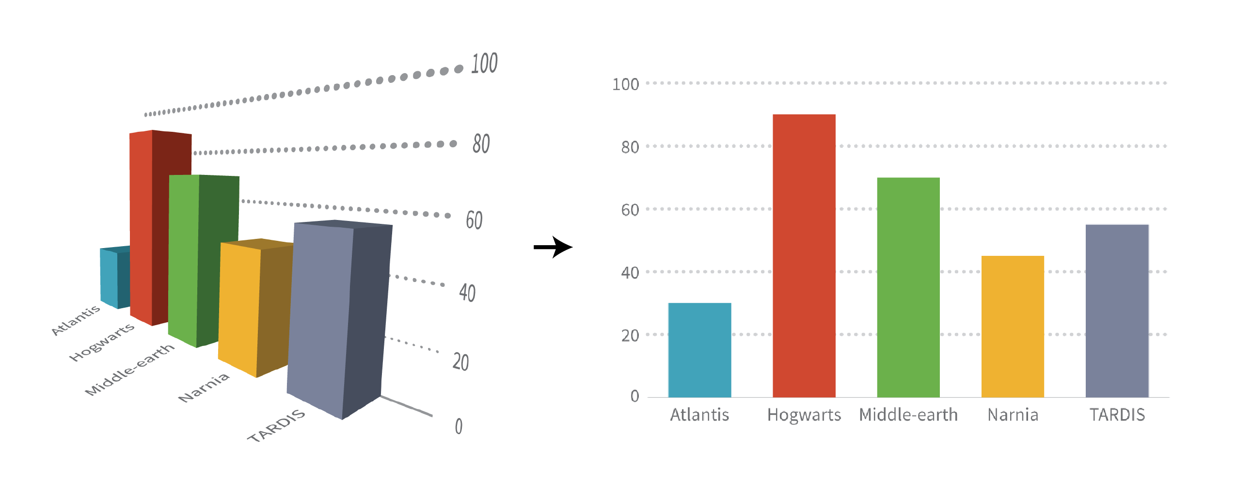
Along the same lines, avoid adding unnecessary icons, hard-to-read fonts, gaudy colors, 3D effects, or any other forms of “chartjunk”--ornamental elements that don’t help clarify anything about the data itself.
While you might think that adding extra elements will make your infographic more appealing, they often only distract from the information you want to communicate.
The focus of your infographic should be A) the charts and B) your notes, labels, and annotations.
Apply style choices uniformly throughout the infographic
Regardless of what colors, fonts, images, or icons you use, be sure to apply styling consistently throughout the graphic.
Notice how color is used consistently (to represent the same response) in each section of this infographic?
That makes comparing responses across populations painless.
Include links to data sources in the infographic footer
Cite your data sources, ideally in link form, in the footer of your infographic. Make it easy for the more curious members of your audience to find and peruse the original data for themselves.
Even if it’s your own original research, linking to the complete data will help your credibility and allow readers to make their own decisions about the data. And who knows--maybe they’ll find something interesting that you missed the first time around!
Conclusion
Sometimes tables and graphs alone just don’t cut it.
While an in-depth analysis of survey results is best presented in a comprehensive report, an infographic is an excellent medium for summarizing your findings for more immediate impact.
Now that you know how to display survey results with the right charts, the infographic design process should be painless. If you get stuck, check out this roundup of our most popular survey results templates.
Or get started right away:


